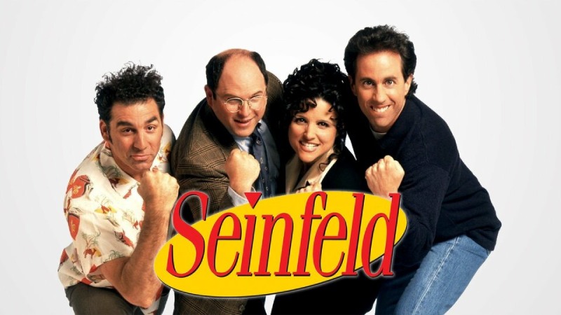
In the world of television, few shows have achieved the iconic status that “Seinfeld” enjoys. Beyond its witty humor and unforgettable characters, the show’s success can also be attributed to its brilliant branding, with the Seinfeld logo standing out as a timeless masterpiece. In this blog post, we’ll delve into the art of branding, exploring how the Seinfeld logo became a symbol of enduring cultural relevance.
The Birth of a Classic Seinfeld Logo
The Seinfeld logo, a simple combination of bold red text against a clean yellow background, is instantly recognizable to fans worldwide. Created by the talented designer Thomas Steenburg, the logo captures the essence of the show’s humor – unpretentious, straightforward, and utterly timeless.
The Choice of Colors
The color palette of the Seinfeld logo is deliberate and strategic. Red, often associated with energy, passion, and excitement, perfectly complements the show’s humor and the dynamics between its characters. The bold, uppercase letters in red create a sense of urgency, mirroring the fast-paced comedic style that became synonymous with Seinfeld.
Contrasting with the vibrant red, the yellow background brings a sense of warmth and friendliness. Yellow is a color associated with optimism and clarity, reflecting the lighthearted nature of the sitcom. The combination of red and yellow not only captures attention but also establishes a visual identity that is both bold and inviting.
Typography Matters
The choice of typography in the Seinfeld logo plays a crucial role in its timelessness. The font used, a modified version of the ITC Fenice typeface, is clean, legible, and devoid of unnecessary embellishments. The simplicity of the lettering allows for easy recognition, making the logo memorable and scalable across various mediums.
Moreover, the boldness of the letters enhances readability, ensuring that even from a distance, the Seinfeld logo remains distinct. This clarity in typography is a testament to the importance of choosing the right font to convey a brand’s personality effectively.
Cultural Relevance and Adaptability
One of the key reasons the Seinfeld logo has stood the test of time is its adaptability to changing cultural landscapes. Despite the show ending in 1998, the logo continues to be relevant and recognizable. Its simplicity allows for easy integration into different contexts, making it suitable for merchandise, promotional material, and digital platforms.
The Seinfeld logo has seamlessly transitioned from the era of traditional television to the digital age, maintaining its appeal across generations. This adaptability is a masterclass in brand longevity, emphasizing the importance of creating a logo that transcends trends and remains relevant in the ever-evolving world of pop culture.
Consistency Across Platforms
The Seinfeld logo’s consistency across various platforms has played a pivotal role in its enduring success. Whether displayed on television screens, merchandise, or digital platforms, the logo maintains its integrity and brand identity. This consistency fosters a sense of familiarity among the audience, reinforcing the show’s image and values.
From the opening credits to promotional material and even the iconic diner setting within the show, the Seinfeld logo is a constant presence. This strategic placement ensures that the logo becomes ingrained in the viewer’s memory, establishing a lasting connection between the brand and its audience.
The Power of Minimalism
The Seinfeld logo is a testament to the power of minimalism in branding. In an era where visual clutter is abundant, the simplicity of the logo makes it stand out. The lack of unnecessary details allows the audience to focus on the essence of the brand – the humor and camaraderie that define Seinfeld.
Minimalistic design not only enhances recognition but also conveys a sense of sophistication and timelessness. The Seinfeld logo’s ability to convey so much with so little is a lesson for brands aspiring to create a lasting impact in a world saturated with information.
The Seinfeld logo is a shining example of the art of branding. From its carefully chosen colors and typography to its adaptability and consistency, every aspect of the logo contributes to its timeless appeal. As businesses navigate the complex world of branding, they can draw inspiration from the simplicity and effectiveness of the Seinfeld logo. In the ever-changing landscape of marketing, creating a brand that stands the test of time requires a thoughtful combination of visual elements, cultural relevance, and adaptability – qualities that the Seinfeld logo embodies with timeless flair.
Last modified: February 14, 2024


